
Decisions decisions!
Remember this painting which i had just placed together but not yet fixed, when I wrote this Beach Clean Art post ?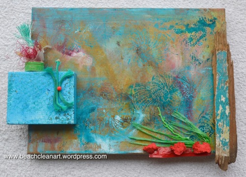
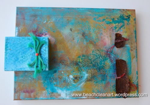
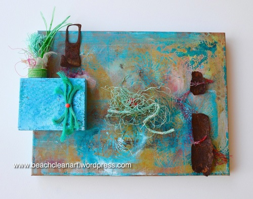
Today I set about fixing it all together. I really like the piece of wood on the right too much to let it go yet, so I replaced that element with some of the rust I found on Ringstead beach.
This is how it looks so far with the small canvas screwed on and the rust attached with a bit of netting and red fishing line
1.
Now I’m driving myself crazy trying to work out where to go next – does it look right as it is – less is more – or is this better …..
2.
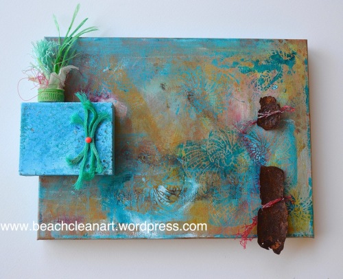
but is the balance right? does this look better?
3.
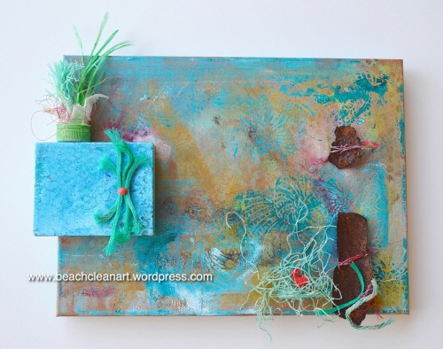
or this
4.
Aaargh! My head is aching!
Can you lovely people help me!?! Which one.
The pressure is on a bit as for the first time ever I am entering three paintings into the Dorset County Show and this might be one of them.
Joining in with Paint Party Friday where you can see masses of wonderful artworks.

 Ravelry
Pingback: Dorset County Show | Wild Daffodil
Pingback: Paint Party Friday | Wild Daffodil
I can see your dilemma – but I think I would go for no 3
LikeLiked by 1 person
Thank you Cathy, it is great to know. ❤
LikeLiked by 1 person
I am late getting my comments out, however I think #4 has the most impact for what you are trying to convey. I love this piece.
LikeLiked by 1 person
Not late at all Nicole – it remains a work in progress and all comments are really very helpful. Thank you so much for taking the time to let me know your thoughts. ❤
LikeLike
if one goes with the notion that the point is to focus people’s attention of (un)clean beaches, then #4 has the greater impact. The more the rust and such pushes against nature the better.
LikeLiked by 1 person
Thank you – great point. Every comment is so valuable and is helping me to hone in on where I will take, not only this piece but the next ones as well. ❤
LikeLike
I think #3 is slightly more…something. Not sure what. And only slightly. I really love them all. (Sorry. Not much help there.)
LikeLiked by 1 person
Thank you Sarah, all comments are helpful, I really do mean that – it is such a wonderful process to get all the feedback and is helping me get clear about the composition. ❤
LikeLiked by 1 person
I love #3 ! I like seeing the detailed line work, #4 covers it up. good luck!
LikeLiked by 1 person
Thanks so much for your comment Karen. I am really enjoying hearing everyone’s thoughts on this piece – it will give the painting a beautiful backstory of co-creation. ❤
LikeLike
I just have to wade in too. I like No.3 best, it seems the most balanced. I really like that piece of wood though and wonder if you have tried it horizontally across the top of the small canvas instead of the bottle top element, it may open up a few more options to try that.
LikeLiked by 1 person
So glad you have joined us Barbara! I love your radical suggestion and am going to try it. That will really change the dynamics of the piece and help me to see it afresh – invaluable! Thank you!!! ❤
LikeLike
More is definitely more here Daffy! I like the fourth one the best, It seems to be well-balanced and is so pretty! 🙂
LikeLiked by 1 person
Thank you Eddie, it really is so helpful to have everyone’s thoughts and opinions. Isn’t it fascinating how we all see different things and like different things about the same piece. I’m loving hearing what everyone thinks.
LikeLiked by 1 person
Yes, it is interesting how we all see something different in the same piece. I look forward to seeing which one gets the vote! 🙂
LikeLiked by 1 person
I think number 3 has just nudged ahead at the moment, but there are now more options to try. It is making me think of doing another similar one to play around with some more.
LikeLiked by 1 person
Why not? It will be fun to see what you come up with next 😉
LikeLiked by 1 person
Thanks Eddie. Hope your weekend goes smoothly and is not too tiring. xx
LikeLiked by 1 person
Thanks Daffy. Just chilling a little before I start work 🙂
LikeLiked by 1 person
❤
LikeLiked by 1 person
My favourite is the last one with the most attachments. Do you have a name for this piece?
LikeLiked by 1 person
Gosh Janice, no, I hadn’t thought of a name – do you have any suggestions?
Thank you so much for letting me know which one you like. ❤
LikeLiked by 1 person
You’re welcome 🙂 no suggestions for the name as I think that should come from the creator..if you want to name it that is 🙂
LikeLiked by 1 person
Once it is finished a name might present itself – for now ‘Decisions’ might be a good title! or maybe even ‘Help!’.
LikeLiked by 1 person
I like that– a transitional name. I hope you show the final work that you display.
LikeLiked by 1 person
I certainly will Janice – I’ve been mostly gardening today – popping in for a bit more arranging on the canvas every so often – a fascinating process and everyone’s feedback has been wonderfully helpful. Still a work in progress.
LikeLiked by 1 person
Hi, Sandra!
Weighing in on these, am very grateful to have read all the previous responses, as they helped clarify & verbalize my thinking. Bearing in mind I tend to be a minimalist…
1. I do like this so much better than the previous. Adding the rust really points up the reds in your work, including where you’ve got some delicate stamping detail. There’s just less distraction… but keep in mind my predilection!
2. Something really bothered me about that bottle cap. Too set. Too identifiable, whilst everything else wasn’t. But it made my eye go directly to the lower middle upward arc of lighter blue. I do like the fringe on that lower piece of rust. In #1 my eye was intrigued with how the rust picked up the reds, but looking back at it I’m also seeing that blue arc.
3. Too busy, too many distractions, replies minimalist moi! 😉
4. What about replacing that bottle cap-bucket with the rust you’ve got over there, and taking out the stringy bit in the middle? The added height might be pleasing, and then there’s the rule of 3’s going with the rust, but still with all that centre detailing clearly visible?
Or have I unintentionally added to your headache? Do hope not!
This is only opinion, and very biased, so…
BEAUTIFUL PIECE, and so thrilling to see it coming together! xx
LikeLiked by 1 person
Everyone is being so generous with their time and attention to detail I feel in a bubble of creative delight! And you, Del, have gone the extra mile! ❤ you star!
Thank you for pointing out the arc of blue – I had not seen that in context – and now, thanks to your comment, I see the need for something above the added little canvas to create that line from top left, down through the canvas and sweeping into the arc of blue – but maybe not the bottle cap – hmmm.
Oh I am so loving this – these discussions are all adding to the depth of the experience of creating this piece – just wonderful!
Thank you so, so much! ❤
LikeLiked by 1 person
Sandra, you are so welcome – I’m so glad you didn’t mind the length, but there’s just so much in this piece already, no matter how you decide to finish it. Have fun! 😘
PS~What are the dimensions?
LikeLiked by 1 person
The large canvas is 12″ x 16″, the small one is 4″ x 5″.
Thank you for your encouragement.
LikeLiked by 1 person
Ah, thank you! Your proportions are spot on, so I had no idea.😍
LikeLiked by 1 person
Thank you for your interest.
LikeLiked by 1 person
I loved the length!! ❤
LikeLiked by 1 person
Phew! (wiping brow gratefully)
LikeLiked by 1 person
Ok the last is my favourite, but I think you need some more red, just off centre.
LikeLiked by 1 person
Brilliant! Thanks Cathy! It is so great to have these wonderful comments they are really helping. ❤
LikeLike
I prefer the 4th version – it just seems balanced. I dare say you’re going to find out (a bit like love) that there’s somebody out there for every one of them.
LikeLiked by 1 person
I love that analogy. I am finding the discussion really useful and helpful, thank you so much for joining in. ❤
LikeLike
2 or 4
LikeLiked by 1 person
Thank you Annette. It is so wonderful to have everyone join in. ❤
LikeLike
I like 3 best. But I also liked the green and red in the bottom right corner in the original. And I agree with Marian St Clair a little red in the pot would balance out nicely.
LikeLiked by 1 person
I’m absolutely loving this discussion! Thank you Jane. I now think the bottle top only works with the original red and green bits bottom right, otherwise it looks out of context. I agree too about more red in the pot. ❤
LikeLike
My favorit is the 3. Love it!
Happy PPF ❤
LikeLiked by 1 person
PPF is so much fun isn’t it Sirkkis! Thank you for letting me know your preference, so glad you like it! ❤
LikeLike
I like #3, it seems nicely balanced to me. Looking great!
LikeLiked by 1 person
That’s so good to know Sal – thank you so much for commenting. ❤
LikeLike
I don’t like the pot in it because it appears to be not reclaimed and seems out of place, whereas the rest is reclaimed from a beach clean. Hope this makes sense but probably isn’t much help. Sorry.
LikeLiked by 1 person
I can see what you mean about the little pot not looking like an item from a beach clean, but it is the top of a plastic bottle parted from it’s body that I found on my first beach clean on Charmouth Beach. Your comment is a huge help, because other people might feel it is out of place too. I really appreciate you taking the time to comment Deborah. Much to think about! ❤
LikeLiked by 1 person
Very helpful – now I’m thinking that the bottle top might be better placed with other bottle tops so that it is more obvious that they are all from the beach. 😉
LikeLiked by 1 person
I like #2 – the two subsequent ones, for me, have too many distractions from the delicate patterns in the background. I like the subtlety.
LikeLiked by 1 person
So good to know which you like the best and why – I really appreciate you taking the time to let me know Jan. ❤
LikeLike
No problem… I love to see the creative process in action 🙂
LikeLiked by 1 person
I’m reminded of the TV programme “What do Artists do All Day” !
LikeLiked by 1 person
I like number 2!
LikeLiked by 1 person
Thank you! It is so helpful to know what fresh eyes are enjoying the best. ❤
LikeLiked by 1 person
I like #3, but I think the little pot on the top left needs more of the dark filament, like the earliest piece.
LikeLiked by 1 person
Thank you Marian, that is really helpful, I agree with you about adding more dark red fishing line to the pot top left. I had taken some out to use it to secure the rust and did not think to replenish it. I really appreciate you taking time to comment. ❤
LikeLike